I’ve been looking for a way to display prettier code snippets on this blog. The SyntaxHighlighter by Alex Gorbatchev, nicely packaged into a WordPress plugin by Viper007Bond, had what I was looking for.
I’ve been using the plugin for a couple of months now and I’m quite happy with it. The only problem, for me, has been that it doesn’t support The D Programming Language. Since I couldn’t find any on the internet, I decided to implement a D brush myself. (It’s quite simple.)
Following Viper’s advice I implemented the support as a tiny WordPress plugin. If you’re using SyntaxHighligher Evolved and want to be able to display syntax highlighted D code, feel free to download shBrushD from my new Shared Stuff page.
Cheers!
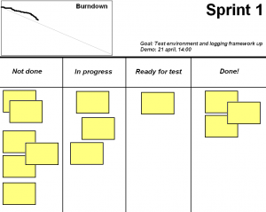
As a project manager, the best tool I’ve come across to help me monitor and control an iteration is The Sprint Task Board. It strikes a perfect balance between expressiveness and visual feedback. One quick look is all you need to make a diagnose of the ongoing iteration. Yet, it contains most of the information needed to make informed decisions.

The task board is absolutely invaluable and I’ll probably never do team related work without it again. The question, though, is whether to use a computerized or a real world one.
Henrik Kniberg recommends the latter. The following quote is from Henrik’s excellent book Scrum and XP from the Trenches.
We’ve experimented with different formats for the sprint backlog,
including Jira, Excel, and a physical taskboard on the wall. In the
beginning we used Excel mostly, there are many publicly available Excel
templates for sprint backlogs, including auto generated burn-down charts
and stuff like that. […]
Instead […] what we have found to be the most
effective format for the sprint backlog [is] a wall-based taskboard!
And there are good reasons for picking an analog task board. Maybe the most significant being:
- Visibility. A wall-based dashboard is always up, always visible. If positioned near the team it’ll work as a constant reminder of the shape of the iteration.
- Simplicity. Planning and re-planning is simply a matter of moving physical cards around, tearing them up or writing new ones.
In my current project we’re using an application (Scrum Dashboard on top of TFS). The reasons are:
- Availability. Actually, this is the only reason for us to use a digitalized task board. We’re having dislocated team members from time to time (did I say we’re ScrumButs?) but since our dashboard is a web application they are able to access it remotely. It would be a lot more painful to relay the information otherwise.
- Automatic burndown update. No need for me (or any one else) to do a work remaining summary and update the burndown chart each and every day.
What are your reasons? I’d be most interested in hearing your point of view on this subject.
Cheers!
A quick WordPress note in case anyone else gets this problem.
Ever since I changed to the iNove theme I have – unknowingly – had a problem with my site in Internet Explorer. The first comment was always blank. Well, it was there in the web page, it just didn’t show in any IE browser. It turned out that I had a deprecated plugin activated. I removed it and now your comments should show again.
Have you seen the presentation in which Google introduces their coming product Google Wave? If not, do so. I believe that the presentation holds a piece of the future. The so called Wave combines the e-mail, chat and newsgroup functionality in a way that makes the whole greater than the parts.
One of the things that caught my attention was the possibility to collaboratively produce documents or Wiki-kind of information in real-time. I had a similar idea several years ago, and seeing it implemented, as a web application –which was unthinkable at the time, makes me happy. There’s a big questionmark though whether this will work in practice. The example in the presentation shows how the information added by the remote users makes the text move around, which is probably going to be annoying in a real situation.
There’s more work to be done there I guess. But the basic functionalities of the Wave, for instance the ability to add comments and start sub threads anywhere in a message is awesome. This new way of communicating will become infrastructure in the future. That’s my quess at least.
One can’t help becoming impressed with Google. They keep pulling these innovative, cool services out of their big bag of tricks, leaving the rest of the business in a state of awe. Google Waves is yet another proof that their free thinking company policy is paying off – big time.
Cheers!
P.S. Special thanks to Paul who sent me the invitation that triggered my interest.
This is a paid review.
I’m not a graphic designer. In fact I stink at everything visual, so design work like layout, images, icons and logos are better handled by somebody else. Unfortunately this is not always possible, and I’m sometimes forced to produce crappy stuff on my own.
Therefore I got quite excited when asked to review The Logo Creator from Laughingbird Software. According to their website anyone could create logos that “look like a Photoshop guru spent hours laboring over!” The question was, could I do it too?
I’m happy to say the answer is yes. I find working with The Logo Creator a joy. It’s easy to create your own logotype based on one of the templates. You can change, add or remove any component of the template, or create your own from scratch. This gives you a lot of creative freedom. I for instance turned this template:

into this logotype:

Which is one of the candidates for becoming the logotype of this website.
I’m not completely happy with the Logo Creator’s user interface, but since it’s so useful to me I overlook the quirkiness. That, and the price of $29.95 – there are seven available themes – makes this a highly recommendable product in my opinion. So, if you need to do some Logo Design of your own, check out The Logo Creator.
Now, if you’ll excuse me I have some logos to create.
Cheers! 🙂


